Introduction
Welcome to Aura, the AI-powered design assistant that helps you create beautiful designs with ease. This documentation will help you get started with Aura and make the most of its features.


Image-first workflow
I Asked GPT Image 2.0 to Imagine a Landing Page, Then GPT-5.5 Built It

WebGL landing pages
Building Animated WebGL Landing Pages with Gemini 3.1 Pro + design.md

Animation workflow
How I Recreate Complex Animations with ChatGPT + Design.md

DESIGN.md refinement
Why This DESIGN.md File Made My AI Design Look So Much Better

Pro landing pages
Gemini 3 is now a pro-level landing page creator

Landing-page quality
Building Better Landing Pages with GPT 5.5 + design.md
Workflow systems
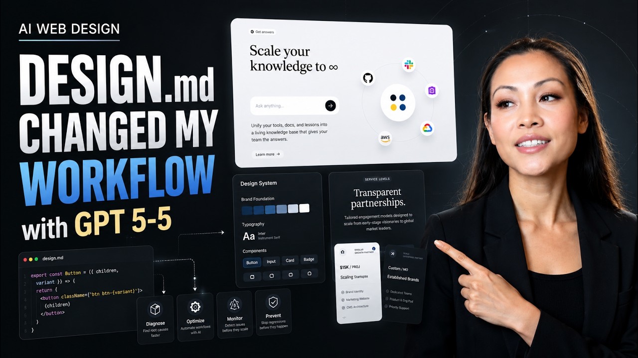
DESIGN.md Changed My AI Web Design Workflow
On this page
Overview
Aura combines the power of AI with intuitive design tools to help you create stunning, responsive websites faster than ever. Build complete multi-page sites with advanced editing capabilities, reference templates with @, and publish with friendly subdomains. Whether you're a professional designer or just getting started, Aura has features that will help you work more efficiently.
Getting the most from Aura
Reference templates and components with @ to add up to 100,000 characters of context (~2,000 lines of code). Access 20,000+ curated assets including images, backgrounds, and stock photos. Use code snippets for border gradients, animations, and effects. Work with prompt-targeted edits to change only specific parts without regenerating entire pages.
Who is Aura for?
- UI/UX designers looking to speed up their workflow
- Developers who need to translate designs to code
- Non-designers who need professional-quality visuals based on templates and prompts
What you'll need
- An Aura account (free or premium)
- Modern web browser (Chrome, Firefox, Safari, Edge)
- Basic understanding of design principles (helpful but not required)
- Figma account (for integration features but not required)
Template made in Aura
Key Features
Advanced AI Models
Access to premium AI models including Claude Sonnet 4.5, GPT-5 and Gemini 2.5 Pro for superior design generation with thinking texts for clearer code reasoning, 4× larger output tokens for full landing pages in one shot, and instant image-to-HTML conversion.
Multi-Page Sites & Publishing
Create multiple pages with element-to-page Links for navigation, add page transitions (fade, slide, scale, blur, push, wipe), publish to friendly subdomains with version updates, export full sites as HTML files, and export to Figma with organized layers intact.
Templates & Components
Access 1000+ premium templates and 1400+ reusable components to jumpstart projects. Browse and remix full templates with all pages, replace elements instantly, create custom components, and share publicly with your team for faster collaboration.
Code References with @
Reference templates, components, and code snippets using @ to add up to 100,000 characters of context (~2,000 lines of code) in a single prompt. Include multiple elements with Shift-click, reference previous chat iterations, and apply preset animations and effects instantly.
Image Generation & Assets
Generate up to 4 image variations with Ideogram, Nano Banana, and Flux 2 Pro. Upload multiple images up to 10MB, access 20,000+ curated assets, remix visuals in Design Mode, instant image-to-HTML powered by GPT-5, and manage with improved attachment previews.
Advanced Design Mode
Full-featured visual editor with Layers panel, Auto Breakpoints, measurement overlays for spacing, Command+Click interactive testing, 1400+ replaceable components, drag-and-drop editing, code snippets for animations and effects, and works on mobile devices for on-the-go design.
Code References with @
The Power of Context
Transform your workflow by referencing templates, components, and code snippets directly in your prompts. The @ symbol unlocks up to 100,000 characters of context—roughly 2,000 lines of code—giving AI the exact ingredients it needs to create precisely what you envision. This is the difference between generic AI output and professional, consistent designs.
What You Can Reference:
- •Full templates - Reference entire landing pages (~31,000 characters) with all sections, styles, and scripts
- •Components - Individual elements like hero sections, navigation bars, cards, buttons, and forms
- •Code snippets - Preset animations, border gradients, progressive blur, alpha masks, and effects
- •Previous iterations - Reference earlier versions from your chat history to build upon
- •Multiple elements - Shift-click to select and reference multiple components at once
Real-World Example:
Instead of prompting:
You can reference specific designs:
This gives AI exact design patterns, maintaining consistency and professional quality across your entire project.
Pro Tip
Start with a base template, then reference specific components to customize it. This approach creates professional designs in minutes that would normally take hours to build from scratch.
Image Generation & Assets
Complete Visual Asset Management
Say goodbye to placeholder images and generic stock photos. Aura integrates powerful AI image generation tools, provides access to a curated library of 20,000+ high-quality assets, and lets you upload your own branded visuals up to 10MB each. Every image need is covered in one place.
AI Image Generation
Generate up to 4 variations simultaneously using multiple AI models:
- • Ideogram - Best for logos and typography
- • Nano Banana - Fast, cost-effective generations
- • Flux 2 Pro - High-quality detailed images
Perfect for custom logos, icons, illustrations, and branded graphics that match your design language.
20,000+ Stock Assets
Browse our ever-growing curated library featuring:
- • High-resolution images (various sizes)
- • Advanced search with keywords
- • Resolution filters for optimization
- • Backgrounds, textures, and patterns
- • Professional photography
Find the perfect visual for any design concept without leaving Aura.
Upload & Convert
Bring your own assets and leverage instant conversion:
- • Upload multiple images (up to 10MB each)
- • Support for transparency (PNG)
- • Image-to-HTML powered by GPT-5
- • Instant mockup conversion
- • Background removal built-in
Attach any design mockup and get working HTML/Tailwind code in seconds.
Remix & Edit Images
Generate variations of existing images right in Design Mode and the Assets panel. Remix uploaded images, library assets, or generated graphics to create the perfect visual without switching tools.
Advanced Design Mode Editor
Professional Visual Editor
A full-featured visual editor that rivals professional design tools like Figma and Webflow. Edit layouts, adjust spacing with visual overlays, modify styles with intuitive controls, and manage complex layer hierarchies—all with an interface that works seamlessly on desktop and mobile devices. Design Mode eliminates the gap between design and code.
Layers Panel
View your complete HTML structure with collapsible sections. Filter by element types, class names, or Tailwind utilities. Manage script and style elements directly in the panel.
- • Search and filter layers
- • Drag to reorder elements
- • Show/hide/lock layers
- • Quick parent/sibling/child selection
Auto Breakpoints
Edit responsive designs contextually. Aura automatically detects which Tailwind breakpoint you're viewing (sm:, md:, lg:, xl:, 2xl:) and applies classes to that specific breakpoint.
- • Automatic breakpoint detection
- • Preview all screen sizes instantly
- • Edit in context
Measurement Overlays
Visual feedback for spacing and positioning. See margin, padding, gap, and absolute positioning measurements overlaid on selected elements. Click any measurement to edit it directly.
- • Visual spacing guides
- • Click-to-edit measurements
- • Smart positioning controls
1400+ Component Library
Replace any element with pre-built, production-ready components. Browse by category (buttons, cards, forms, hero sections, etc.) with contextual search that surfaces relevant components based on what you're editing.
- • One-click element replacement
- • Create custom components
- • Share publicly with team
Interactive Testing
Test interactive elements without switching modes. Hold Command (Mac) or Ctrl (Windows) and click buttons, menus, modals, and toggles to verify functionality while staying in Design Mode.
- • Test buttons and links
- • Preview animations
- • Check hover states
Code Snippets
Apply advanced effects instantly without writing code. Save your own snippets for reuse across projects. Access presets for common patterns like border gradients, progressive blur, gradient alpha masks, and complex animations.
- • Border gradients
- • Keyframe animations
- • Alpha/blur masks
Works on Mobile Devices
Design Mode adapts to smaller screens with touch-optimized controls. Edit designs on the go with your phone or tablet—perfect for making quick tweaks or previewing mobile layouts in their native environment.
Multi-Page Sites & Publishing
From Single Pages to Complete Websites
Build complete, production-ready websites with multiple pages, navigation systems, and smooth transitions between routes. Publish to friendly subdomains that update seamlessly with each iteration, export full sites as HTML for self-hosting, or send your designs back to Figma with organized layers. Everything needed to take projects from prototype to production.
Multi-Page Architecture
Create as many pages as you need for your project:
- • Create pages from scratch or duplicate existing ones
- • Convert pages to standalone projects
- • Manage page order and organization
- • Share common components across all pages
- • Maintain consistent fonts, colors, and styles site-wide
Build complete sites: homepage, features page, about, pricing, contact, blog—whatever structure you need.
Element-to-Page Links
Turn any element into a navigation link:
- • Click any element and set its Link target
- • Works with buttons, images, text, cards—anything
- • Navigate between pages on click
- • Build complex navigation menus
- • Create interactive prototypes with real navigation
No coding required—just select an element, choose a destination page, and you're done.
How to Build a Multi-Page Site
- Open the Pages menu and create the new page you want to add to the site.
- Prompt that page separately so it becomes the design or layout you want.
- Return to the page with your button, icon, or menu item and open Design Mode.
- Select the element you want to make clickable, then set its Link target in the Edit Popover.
- Preview the navigation, then publish or export the full site when the pages are connected the way you want.
7 Built-In Page Transitions
Add polished motion to navigation with smooth, professional transitions that convey hierarchy and flow:
Fade
Gentle crossfade
Slide
Horizontal motion
Scale
Zoom in/out
Blur
Defocus effect
Push
Slide & displace
Wipe
Reveal animation
Instant
No transition
Publish Online
Share your work instantly:
- • Friendly .or.build subdomains
- • Version updates (same URL)
- • No redeployment needed
- • Share links immediately
- • Perfect for client presentations
Export HTML
Download complete sites:
- • Full HTML/CSS/JS files
- • All pages in one package
- • Host on Netlify, Vercel, etc.
- • Continue in code editors
- • No vendor lock-in
Export to Figma
Send designs to Figma:
- • Organized layer structure
- • Icons, texts, styles preserved
- • Continue design in Figma
- • Browser console method
- • Seamless roundtrip workflow
Real Code, Real Websites
Everything in Aura is pure HTML, Tailwind CSS, and vanilla JavaScript. No proprietary frameworks, no custom runtime—just standard web technologies that work everywhere. Export and continue development in v0, Lovable, Cursor, or any code editor.
Figma Integration
Aura offers seamless integration with Figma through two powerful methods that allow you to import designs from Figma and export your Aura creations back to Figma.
Import from Figma
- 1Open your design in Figma
Navigate to the frame or component you want to import into Aura.
- 2Select the element and use "Copy link to selection"
Right-click on your selection and choose "Copy link to selection" or use the share button and copy the link.
- 3Paste the URL in Aura
In Aura, use the "Import from Figma" option and paste the copied URL to import your design elements.
- 4Confirm that you have the correct design
Aura will process your Figma design and show you a preview. If you see your entire page, make sure to right-click the frame / Copy/Paste as / Copy link to selection. Do not use Command + L.
Export to Figma
- 1Select your design in Aura
Choose the element or frame you want to export to Figma.
- 2Use "Copy Console Code" feature
In Aura's export menu, select "Export to Figma" and click "Copy Console Code".
- 3Open Figma and access the Console
In Figma, open the document where you want to place the design. Open the browser's developer console (Command /, search console. Click Show/Hide console).
- 4Paste and execute the code
Paste the copied code into the console and press Enter. The code will create your Aura design in Figma, preserving styles and structure. For the first time, you'll need to type "allow pasting" in the console.
Exported From Aura
Figma designs generated and exported from Aura:
Viewing Tips
- Use the scroll wheel to zoom in and out of the design
- Hold spacebar and drag to pan around the canvas
- Click on elements to see their properties and styles
Why Aura?
In today's fast-paced design world, efficiency is key. Aura was built to address common pain points in the design workflow:
Time Efficiency
Reducing time spent on repetitive design tasks allows you to focus on creativity and problem-solving.
Design-Dev Collaboration
Bridging the gap between design and development with code generation and seamless handoffs.
Rapid Prototyping
Enabling rapid prototyping and iteration to quickly test and refine design concepts.
Community Sharing
Share your designs with the community and build upon existing templates to accelerate your workflow and inspire others.
Effective Prompting
Well-structured prompts are the key to getting precise, usable designs from Aura. The more specific your instructions, the better the output you'll receive.
The key to getting the most out of Aura is crafting effective prompts. Well-structured prompts lead to better AI-generated designs and code.
Prompt Structure
Be specific about what you want, including:
- Framework preferences (Tailwind, Bootstrap, etc.)
- Component structure and layout
- Color schemes and styling details
- Responsive behavior requirements
- Interactive elements and animations
Examples
Basic prompt (less effective):
Create a contact formDetailed prompt (more effective):
Generate a responsive contact form using Tailwind CSS with form validation, floating labels, and a subtle purple accent color.Sample Prompts to Try
Referencing existing design systems and using device framing can dramatically improve your results. Brand-inspired styling creates familiarity, while device framing helps visualize how designs will appear in real-world contexts.
Hero Section
Generate a modern hero section for a SaaS product with Tailwind CSS. Include a headline, subheading, CTA button, and a floating mockup image on the right side. Make it fully responsive.Navigation Bar
Design a sticky navigation bar with logo on left, navigation links in center, and login/signup buttons on right. Make it collapse to a hamburger menu on mobile, with a smooth slide-in animation.Mobile Responsiveness
Create a layout that switches from 3 columns on desktop (1024px+) to 2 columns on tablet (768px to 1023px) and 1 column on mobile (below 768px).Brand-Inspired Styling
Design a settings page in the style of Apple's iOS interface with clean typography, minimal UI elements, rounded corners, and subtle shadows. Use a color palette of white backgrounds with blue accents.Using @ to Reference Templates
Create a landing page using @hero-section-template and @testimonial-cards. Add a features section with gradient backgrounds and smooth scroll animations. Use the color scheme from @brand-colors.Prompt-Targeted Edits
Edit only the hero section: change the headline to "Build Faster with AI" and swap the CTA button color to purple-600. Keep everything else unchanged.Pro Tip
For complex designs, try a stepwise approach: Start with a basic structure, then refine in subsequent prompts by adding specific details, styling, and interactions.
Template made in Aura
Getting Started
Ready to dive in? Aura is a web app—simply create an account and start designing:
Create Account
Sign up for free at aura.build and start creating beautiful designs with AI assistance.
Tips for Prompting
Learn how to craft effective prompts for HTML generation and get better results.
Need more guidance? Check out our video tutorials and documentation.