
Lesson 06
Why This DESIGN.md File Made My AI Design Look So Much Better
Overview
A workflow for improving AI-generated UI by giving Aura a DESIGN.md file before refining a landing page. The lesson compares a plain detailed prompt, a simple skeuomorphic style instruction, and a stronger DESIGN.md reference so the difference in visual identity is easy to see.
After the first pass, the video focuses on the real refinement loop: improving navigation, replacing generic sections, adapting Aura components with ChatGPT, and carrying the same visual DNA through pricing, FAQ, CTA, footer, and motion polish.
A detailed prompt can produce a usable landing page, but it often cannot create a specific visual identity by itself. This lesson shows the difference between a generic first pass, a broad style instruction, and a stronger DESIGN.md-backed generation.
The turning point is giving Aura a reusable design system before refinement begins. DESIGN.md gives the page a clearer sense of materials, surfaces, spacing, shadows, typography, buttons, and section rhythm. The first generation is not perfect, but it starts from a more specific visual place.
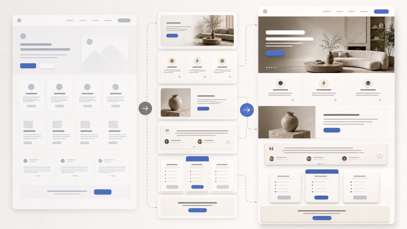
The workflow is:
generic baseline -> style exploration -> DESIGN.md visual DNA -> targeted edits -> component replacements -> full-page polish
The lesson is really about making AI design easier to refine by starting with stronger visual direction.
Why Start From the Generic Output?
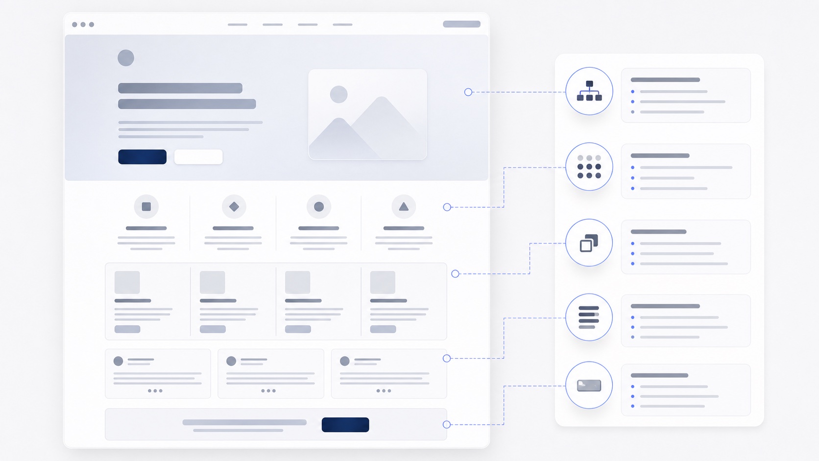
The lesson begins with a detailed landing-page prompt and a useful but generic result. The page has structure, but the identity is thin: repeated cards, familiar icons, predictable sections, and a layout that does not yet feel specific to the product.
That baseline is important because it separates content structure from design direction. A prompt can tell Aura what sections to include, but it does not always define material, depth, spacing, or component personality strongly enough.
Look for the clues that the page needs a stronger system:
- repeated card shapes
- generic icons or feature rows
- weak hero hierarchy
- similar section pacing from top to bottom
- visual details that could belong to almost any SaaS page
The baseline gives you something concrete to improve.
What Does a Style Phrase Fix?
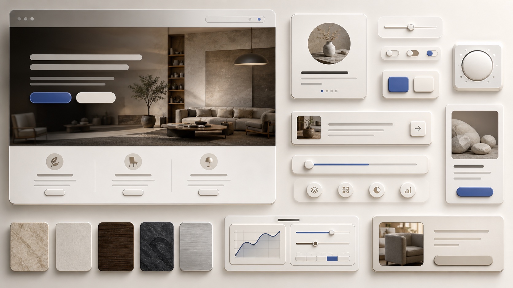
The video tests whether a simple style phrase can improve the result. Asking for a skeuomorphic direction adds more physical buttons, softer shadows, and a stronger sense of depth.
That helps, but it still leaves many decisions open. Style words are useful for exploration, but they are broad. The model still has to guess how surfaces behave, how deep the shadows should be, how typography should scale, and how components should relate to each other.
Use style words to find a direction quickly, then check whether the result is consistent:
- do the materials feel intentional?
- are the shadows and surfaces used the same way?
- does the typography support the mood?
- do the buttons and cards belong to the same system?
When the style needs precision, move from adjectives to DESIGN.md.
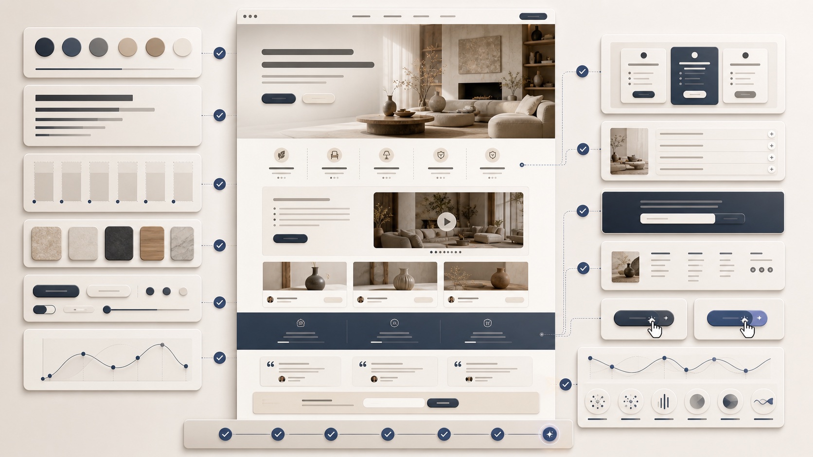
Why Does DESIGN.md Work Like Visual DNA?
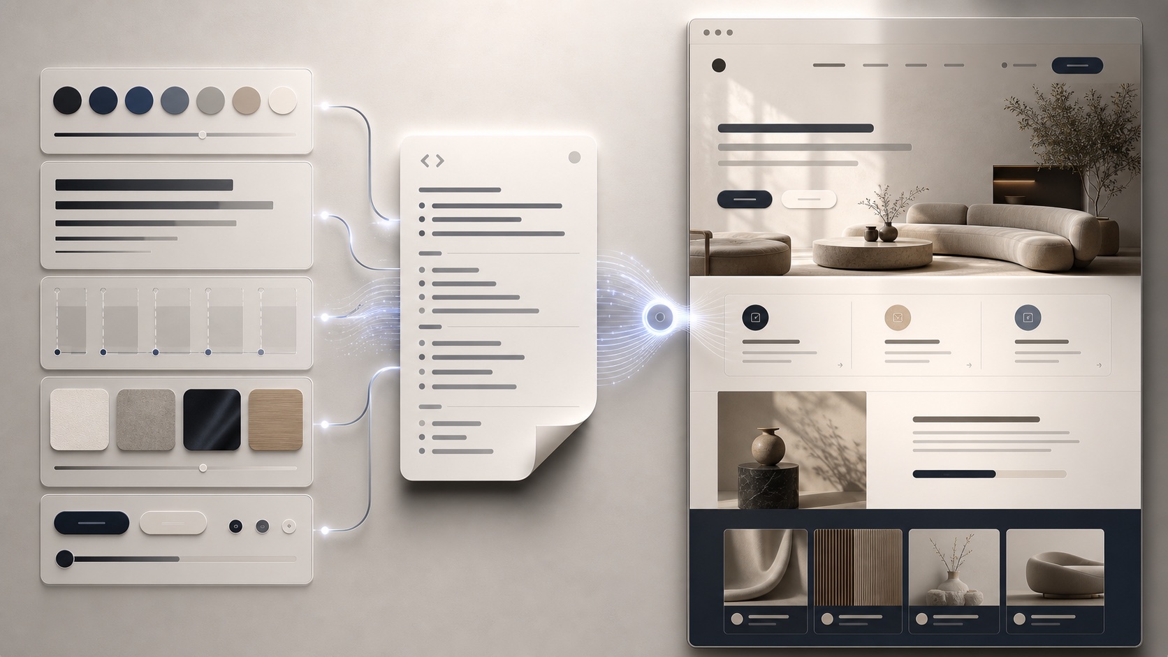
The turning point is adding a stronger DESIGN.md reference. Instead of asking Aura to guess what premium skeuomorphic UI means, the prompt gives it a reusable system with clearer expectations for mood, surfaces, spacing, shadows, typography, and component language.
The result has a more intentional identity. DESIGN.md does not make the first generation final, but it makes the starting point more specific and easier to refine.
That is the practical value of visual DNA:
- typography has a clearer scale
- surfaces and shadows feel more deliberate
- buttons inherit a recognizable treatment
- spacing has more consistent rhythm
- sections feel like parts of the same product
The designer still reviews the page, but the work starts from a better draft.
How Do You Refine Navigation and Hero Details?
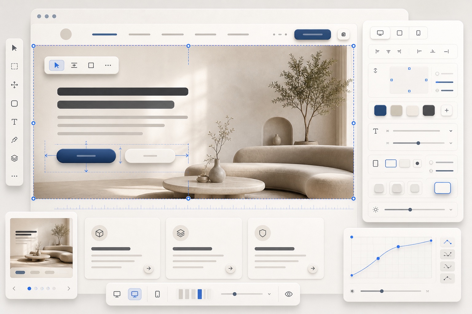
Once the visual system is stronger, the workflow shifts into targeted refinement. The video improves the navigation and hero details with focused edits instead of restarting the entire page.
That keeps the useful parts of the generation intact. Smaller edits are better for details like button treatment, nav clarity, hero composition, spacing, and the tactile cues that make the interface feel polished.
Use Edit mode when the direction is right but the details need work:
- Keep the overall layout.
- Select the weak area.
- Describe the specific change.
- Preserve the visual system that is already working.
The goal is to make the hero trustworthy before spending time on the rest of the page.
How Do Component References Replace Weak Sections?
The middle of the lesson is about replacing sections that still feel too generic. Aura components and ChatGPT become reference material for stronger blocks, so the page can keep the same visual DNA while gaining better section structure.
This is more reliable than one-shot prompting. Instead of accepting every generated section, you identify the weak parts, bring in a better structure, and adapt it back into the same design language.
Use component references when:
- a section repeats familiar AI patterns
- the layout has the right content but weak composition
- pricing, FAQ, CTA, or feature blocks need more structure
- you want a stronger section without changing the whole page
The reference gives structure. DESIGN.md keeps the replacement from feeling disconnected.
What Makes the Final Page Feel Coherent?
The final pass carries the visual system across pricing, FAQ, CTA, footer, and animated background details. The goal is not just to make one section look better. The goal is to make the whole landing page feel like one coherent product direction.
Check every section against the same visual DNA:
- does the spacing still match?
- do the buttons feel consistent?
- do shadows and surfaces behave the same way?
- is the CTA visually connected to the hero?
- does motion support the page instead of distracting from it?
The larger lesson is that AI design improves when you stop starting from zero. DESIGN.md gives Aura a clearer visual target, component references improve weak sections, and human review turns the generated page into something intentional.